Making your iOS app more accessible with dynamic type
26 May 2025
I recently attended an event at Apple London for Global Accessibility Awareness Day, which spurred me to make my app Personal Best more accessible.
I’m still working on adding better VoiceOver support, but I’m happy to say that Personal Best now works great at all dynamic type sizes. This means that no matter what text size people use the app will be fully usable.
Dynamic type primer
Dynamic type is an Apple feature for customising your text size. As of May 2025 there are twelve possible values: xSmall, small, medium, large (default value), xLarge, xxLarge, xxxLarge, AX1, AX2, AX3, AX4, and AX5. The AX in the latter five sizes stands for accessibility.
In terms of dynamic type support, apps fall into one of three categories:
1. Unsupported
Some apps don’t support dynamic type at all. The font is always the same size regardless of your dynamic type setting.
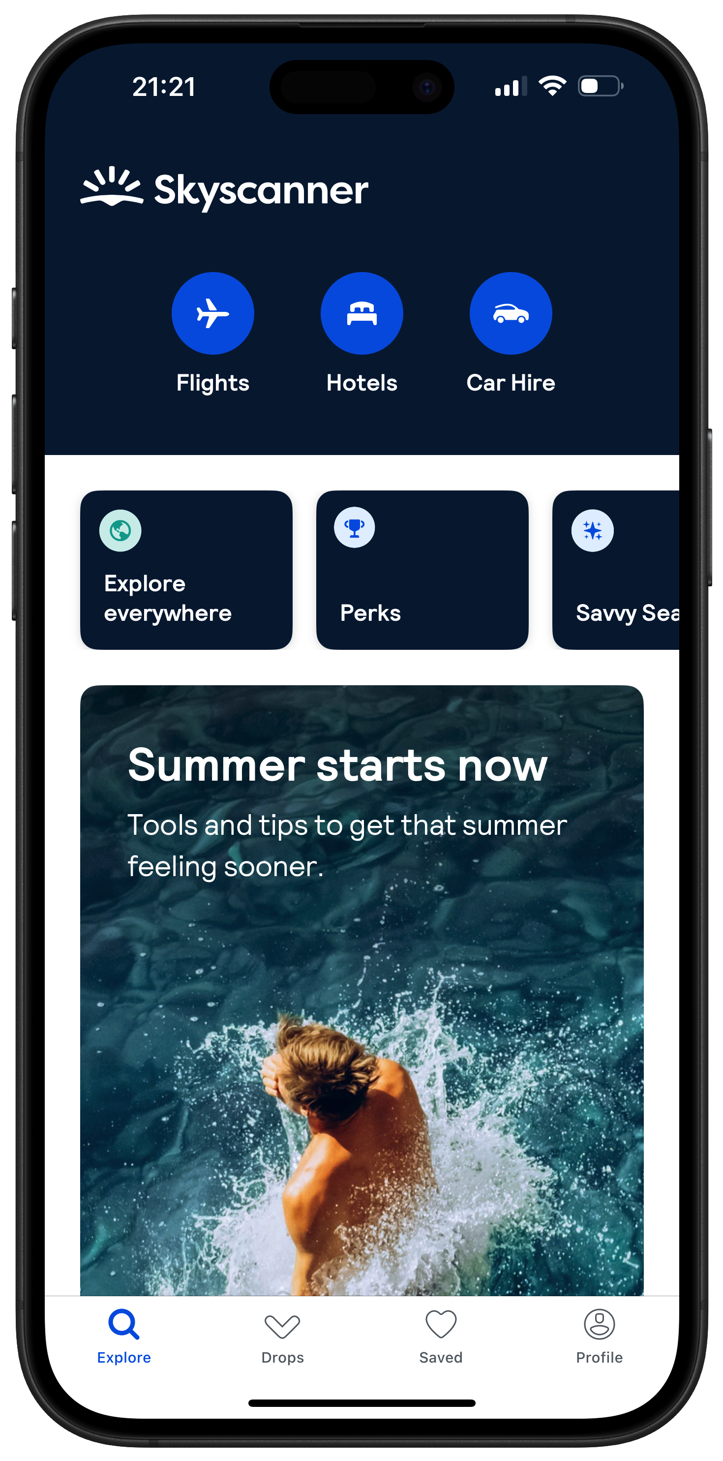
Below is the Skyscanner app with my font size at the AX5 (highest) setting. You can see it’s stuck showing text at the default size because they’ve opted out of dynamic type entirely.
2. Supported but broken
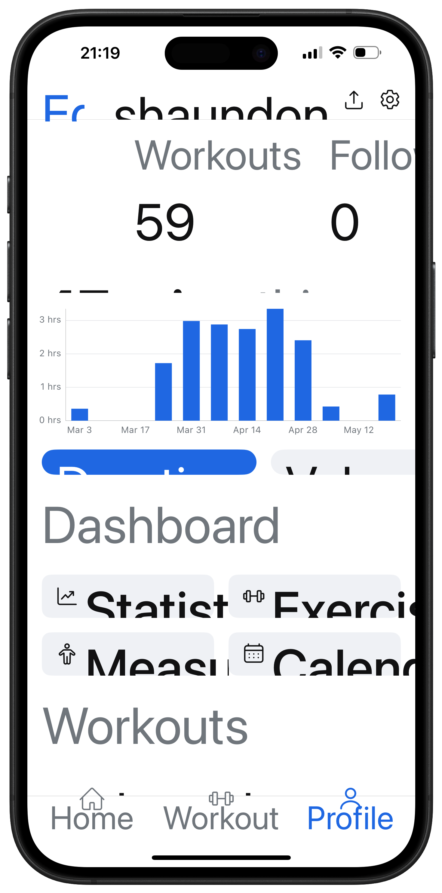
Some apps support dynamic type but haven’t been fully optimised, so some elements look broken or cut off. An example of this is the weightlifting app Hevy where a lot of text gets cut off.
3. Fully supported
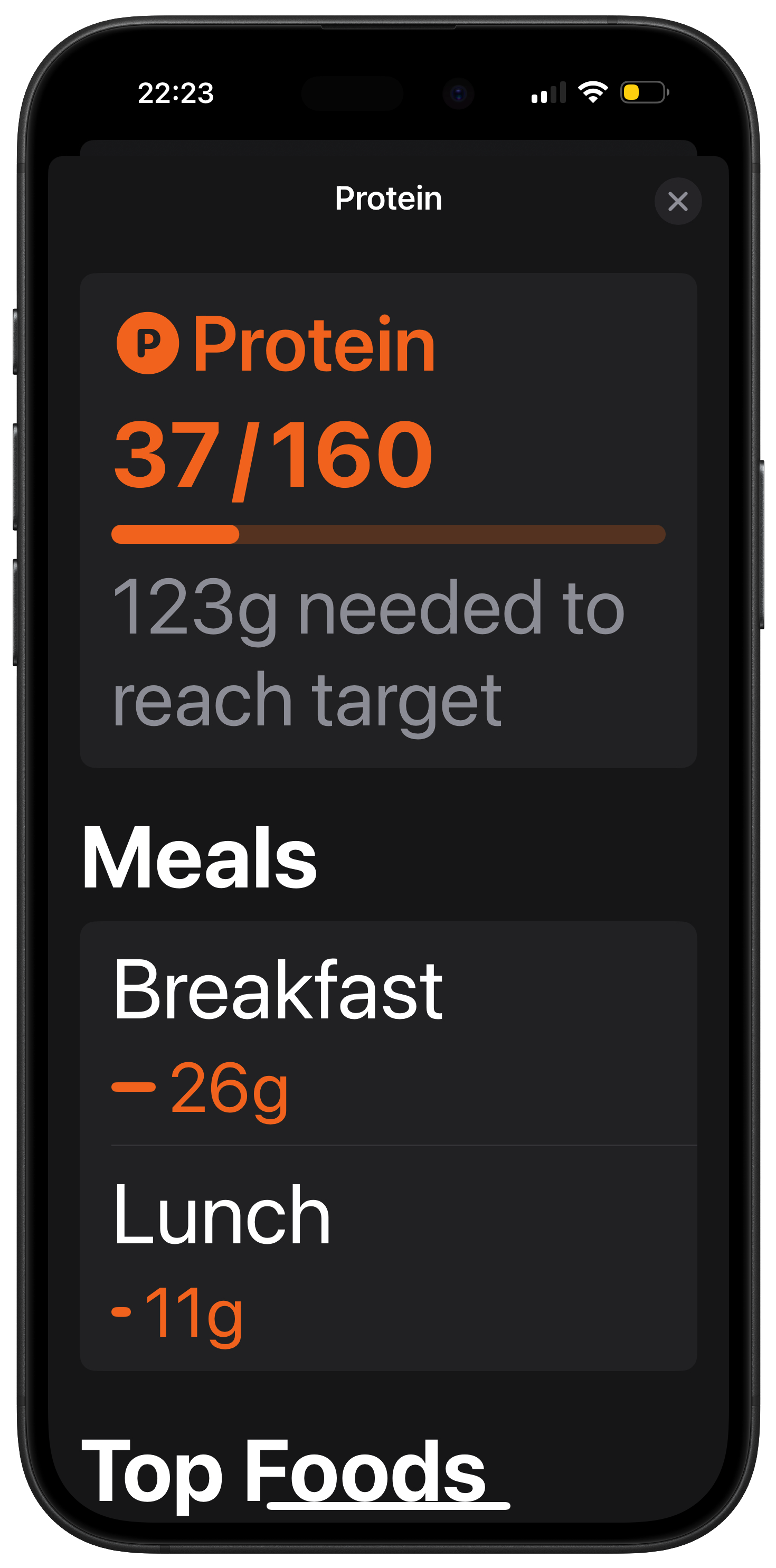
Finally, we have apps that work perfectly at all dynamic type sizes. The text grows and shrinks according to the user’s text size, and everything still looks and works great. An example of this is Foodnoms, my food tracking app of choice.
The state of Personal Best
Before starting this work Personal Best was in category #2. There were parts that looked ok, but a bunch of issues in almost every screen with text getting cut off or otherwise looking bad.
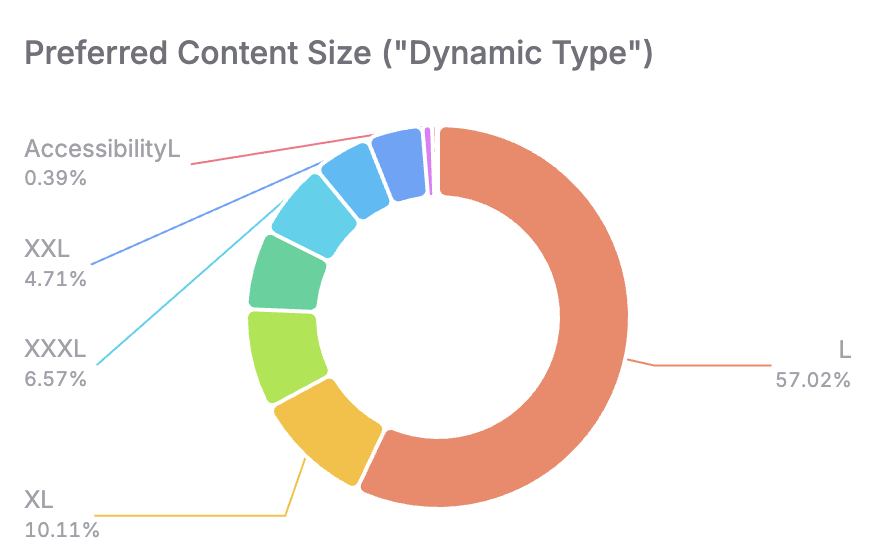
I want Personal Best to be a best-in-class iOS app, which means making it work great for everyone. Not only is this the right thing to do, it’s also a business opportunity. My TelemetryDeck analytics indicates that very few of my users are using the AX text sizes, which could be an indication that I was leaving the needs of a significant section of the market unaddressed.
To fix the issues, I went through every screen and checked it at the AX5 size, and every time something looked broken, I’d adapt the layout to fix it. Then I’d put the text back to the default size, and check I hadn’t inadvertently broken anything in the process.
Fixing it
I found that every issue fell into one of three categories:
- Non-scrollable content
- Insufficient horizontal space
- Custom approach required
Here’s how I approached each of these issues.
Non-scrollable content
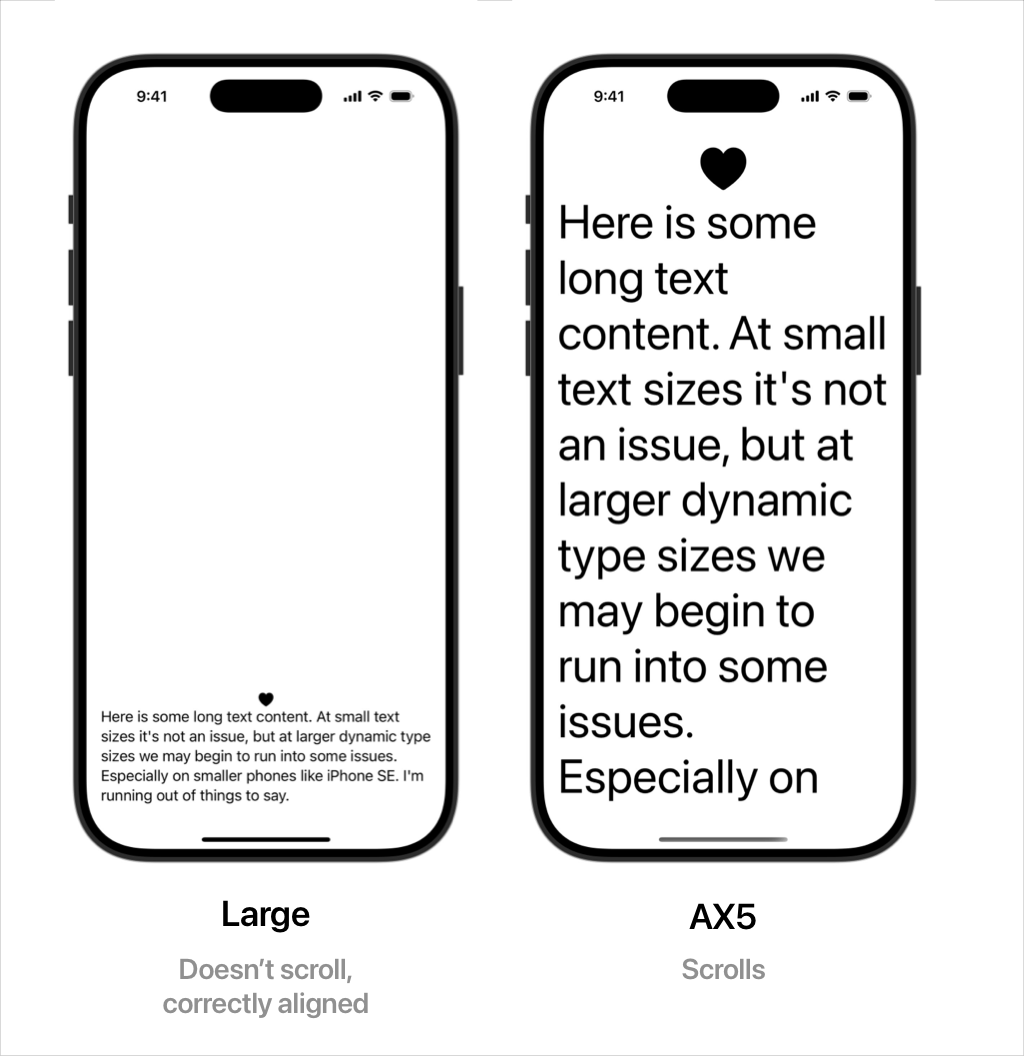
Often we’ll have some content that fits fine at smaller sizes, but at very large ones it goes off the screen. Unlike on the web, SwiftUI views don’t scroll by default when they overflow.
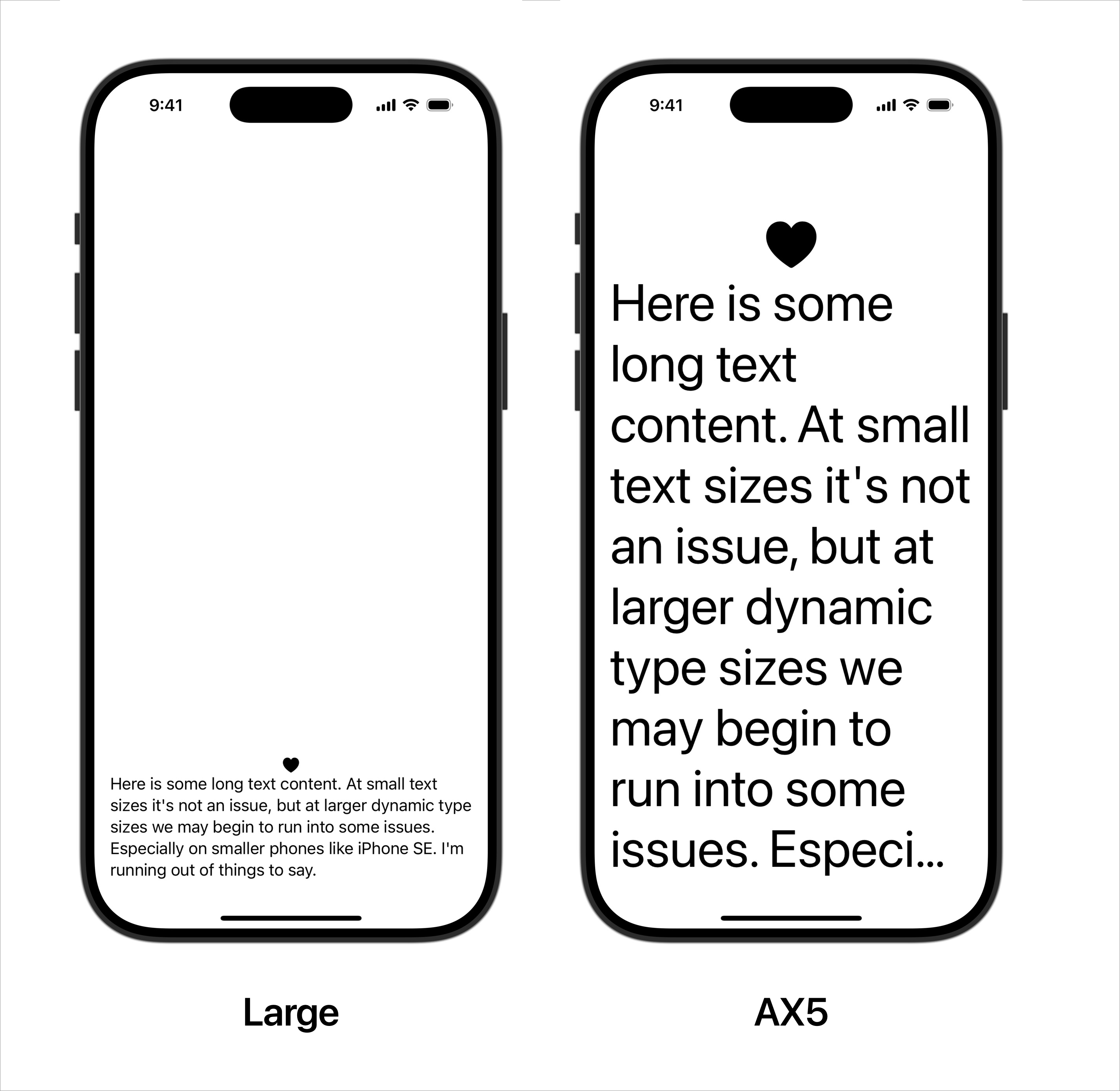
In the screenshot above, the text gets cut off and there’s no way for users to see the end of the text.
A simple fix is to wrap it all in a ScrollView. This solves the problem but replaces it with a different problem. We’ve broken the layout at non-AX type sizes – our content was bottom aligned but that’s no longer the case.
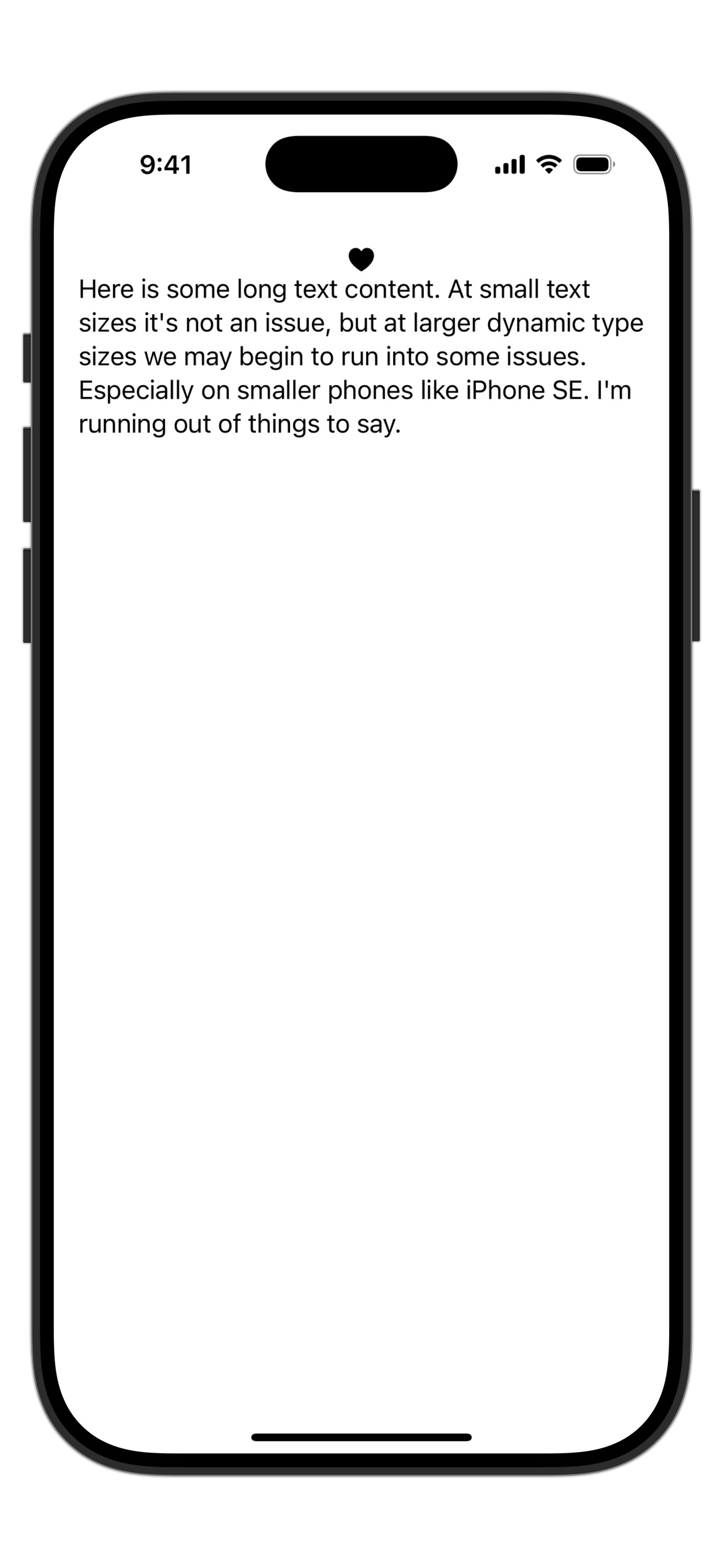
To fix this, we can make the ScrollView only display when needed. For this I turned to Daniel Klöck’s ScrollViewIfNeeded package. This is a great utility which only adds a ScrollView if the content is large enough to need it. Here’s how the code looks:
ScrollViewIfNeeded {
  VStack {
    Spacer()
    Image(systemName: "heart.fill")
    Text("Here is some long text content. At small text sizes it's not an issue, but at larger dynamic type sizes we may begin to run into some issues. Especially on smaller phones like iPhone SE. I'm running out of things to say.")
  }
}
And here’s how it looks in practice:
Insufficient horizontal space
I use HStack extensively to lay content out side by side. At large sizes the available space is reduced because more of it is taken up by text, and the content can become difficult to parse. Here’s a typical example of this issue:
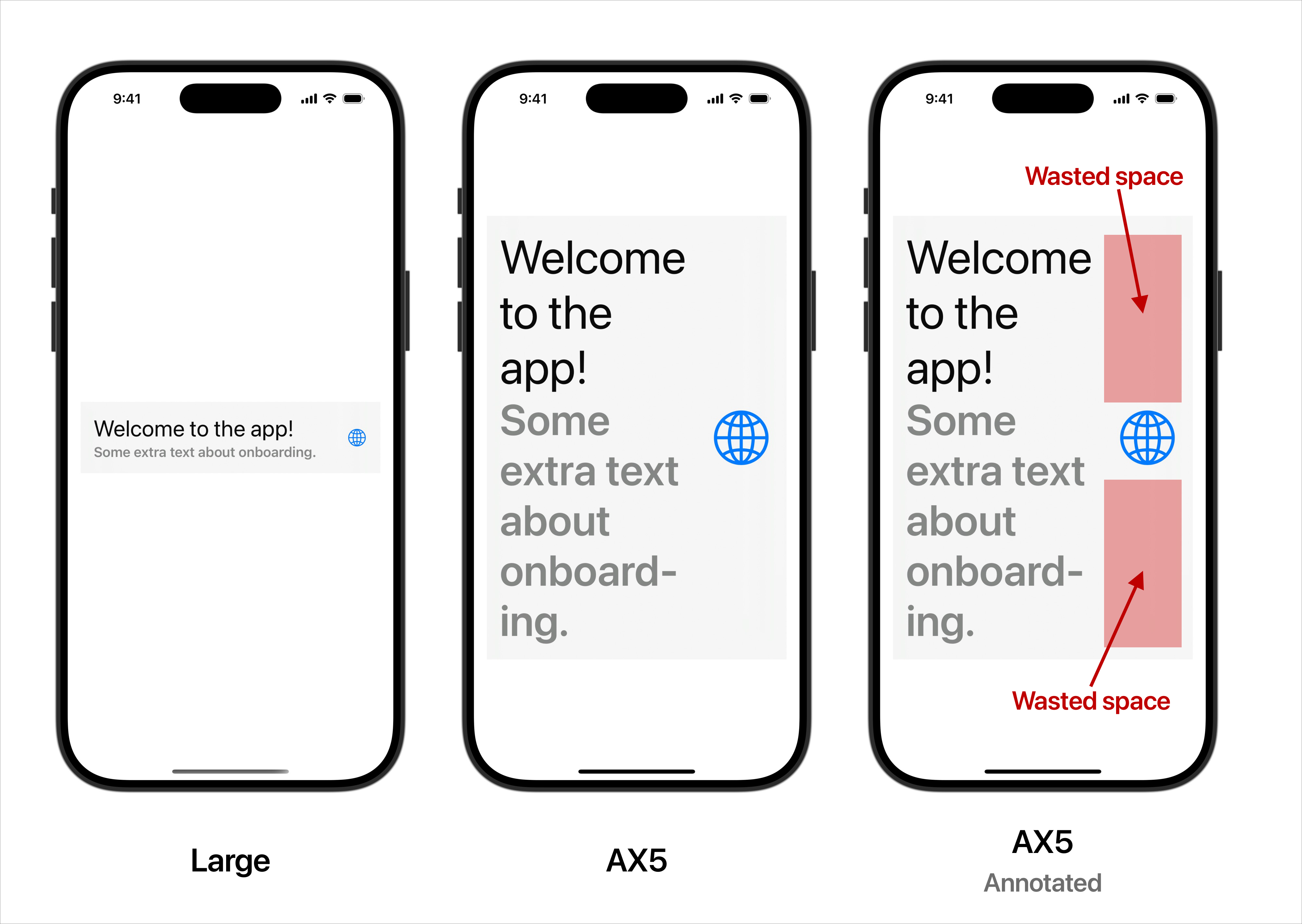
While it’s still pretty readable, it could be better. The icon on the trailing edge has a lot of empty space above and below it. If we give that space to the text, it won’t need to wrap as much. To do this, we change the layout at larger sizes to use a VStack instead of a HStack.
SwiftUI has a couple of ways to achieve this: ViewThatFits and dynamicType.isAccessibilitySize. These allow us to detect if we’re running out of space or if the user is using an AX type size and show a different layout. Here’s how that looks:
Using ViewThatFits
ViewThatFits {

  // Original HStack-based layout
  HStack {
    VStack(alignment: .leading) {
      Text("Welcome to the app!").font(.title)
      Text("Some extra text about onboarding.")
        .font(.headline)
        .foregroundStyle(.secondary)
    }
    Spacer()
    Image(systemName: "globe")
      .imageScale(.large)
      .foregroundStyle(.tint)
  }

  // Alternative VStack-based layout
  VStack {
    VStack(alignment: .leading) {
      Text("Welcome to the app!").font(.title)
      Text("Some extra text about onboarding.")
        .font(.headline)
        .foregroundStyle(.secondary)
    }
    Image(systemName: "globe")
      .imageScale(.large)
      .foregroundStyle(.tint)
  }
}
.padding()
.background(.regularMaterial)
This works quite well. Our original HStack layout is used initially, but at larger sizes we get a VStack-based layout.
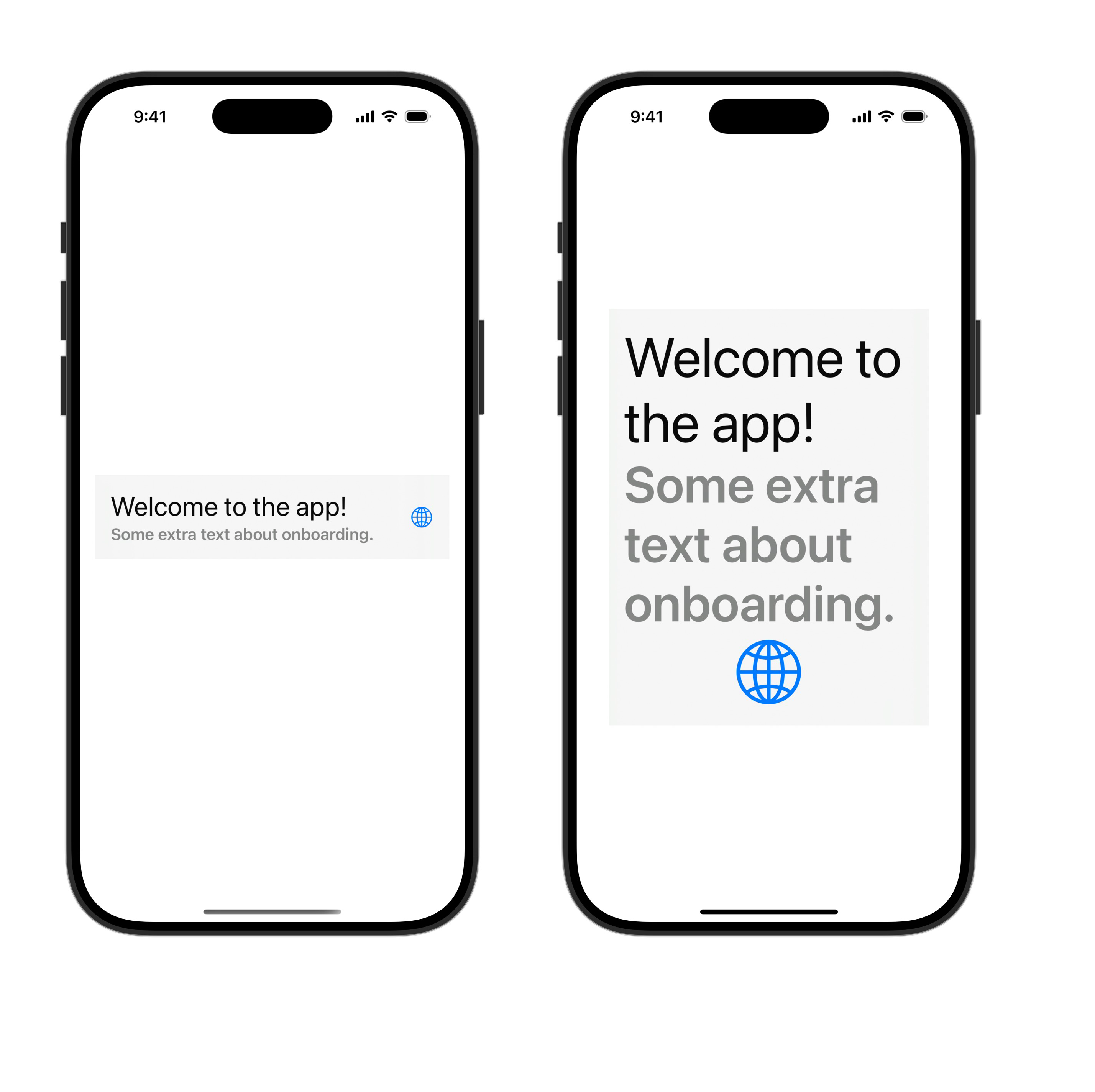
This is a big improvement. Instead of eight lines the text now only occupies five lines, and ‘onboarding’ doesn’t need to be hyphenated; it fits on one line.
There is a potential issue however. The VStack-based layout kicks in at the xLarge size, when it probably didn’t need to. I’m not knowledgeable enough about SwiftUI’s layout system to know why this happens. In your case this might not be a problem, but for me I wanted to maintain the HStack-based layout until it didn’t make sense anymore. For this, I turned to dynamicType.isAccessibilitySize.
Using dynamicType.isAccessibilitySize
We can use SwiftUI’s environment to detect the current type size, which comes with a convenient property to check whether it’s one of the AX sizes. We can use this to only change to the VStack-based layout when the user is using an AX size:
@Environment(\.dynamicTypeSize) private var dynamicTypeSize

...

Group {
  if dynamicTypeSize.isAccessibilitySize {

    // VStack-based layout
    VStack {
      VStack(alignment: .leading) {
        Text("Welcome to the app!").font(.title)
        Text("Some extra text about onboarding.")
          .font(.headline)
          .foregroundStyle(.secondary)
      }
      Image(systemName: "globe")
        .imageScale(.large)
        .foregroundStyle(.tint)
    }
  }

  else {

    // HStack-based layout
    HStack {
      VStack(alignment: .leading) {
        Text("Welcome to the app!").font(.title)
        Text("Some extra text about onboarding.")
          .font(.headline)
          .foregroundStyle(.secondary)
      }
      Spacer()
      Image(systemName: "globe")
        .imageScale(.large)
        .foregroundStyle(.tint)
    }
  }
}
.padding()
.background(.regularMaterial)
This approach isn’t necessarily better than using ViewThatFits, it’s just different. You should choose whichever approach makes the most sense for the screen you’re adapting.
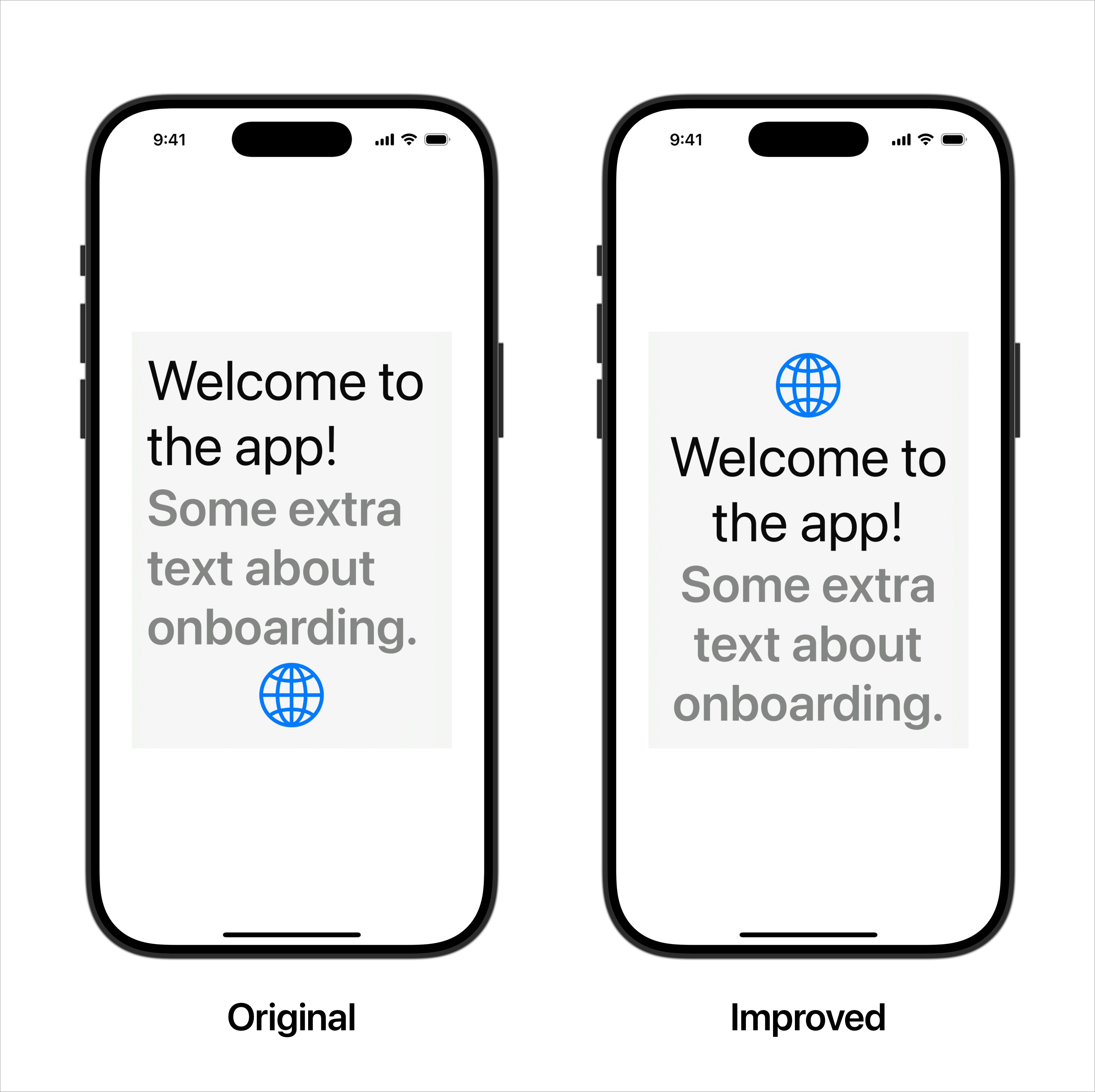
Going the extra mile
This works well, but we can enhance it a bit more by making the VStack-based layout look a bit more at home. It’s nice when the screen works fine at large type sizes, but we can go the extra mile by making it look great. Let’s now tweak the layout to look a bit nicer:
if dynamicTypeSize.isAccessibilitySize {
  VStack(alignment: .center) {
    Image(systemName: "globe")
      .imageScale(.large)
      .foregroundStyle(.tint)
      Text("Welcome to the app!")
      .font(.title)
      .multilineTextAlignment(.center)
      Text("Some extra text about onboarding.")
        .font(.headline)
        .foregroundStyle(.secondary)
        .multilineTextAlignment(.center)
  }
}
Here I’ve removed a redundant second VStack, centre-aligned everything, and moved the image to the top of the view.
Cleaning it up
There’s a lot of duplication in this code because we’re defining two completely different layouts. We can clean this up by making a new reusable view that abstracts away much of the logic for, named HOrVStack:
struct HOrVStack<Content: View>: View {
  @Environment(\.dynamicTypeSize) private var dynamicTypeSize
  let content: Content
  let flipAt: DynamicTypeSize
  let horizontalAlignment: HorizontalAlignment
  let verticalAlignment: VerticalAlignment

  init(
    flipAt: DynamicTypeSize = .accessibility1,
    horizontalAlignment: HorizontalAlignment = .center,
    verticalAlignment: VerticalAlignment = .center,
    @ViewBuilder content: () -> Content
  ) {
    self.content = content()
    self.flipAt = flipAt
    self.horizontalAlignment = horizontalAlignment
    self.verticalAlignment = verticalAlignment
  }

  var layout: AnyLayout {
    if dynamicTypeSize < flipAt {
      AnyLayout(HStackLayout(alignment: verticalAlignment))
    } else {
      AnyLayout(VStackLayout(alignment: horizontalAlignment))
    }
  }

  var body: some View {
    layout { content }
  }
}
Usage
...

var imageView: some View {
  Image(systemName: "globe")
    .imageScale(.large)
    .foregroundStyle(.tint)
}

var textAlignment: TextAlignment {
  return dynamicTypeSize.isAccessibilitySize ? .center : .leading
}

@ViewBuilder
var hStackView: some View {
  HOrVStack(horizontalAlignment: .center) {
    if dynamicTypeSize.isAccessibilitySize { imageView }
    VStack(alignment: .leading) {
      Text("Welcome to the app!")
        .font(.title)
        .multilineTextAlignment(textAlignment)
      Text("Some extra text about onboarding.")
        .font(.headline)
        .foregroundStyle(.secondary)
        .multilineTextAlignment(textAlignment)
    }
    if !dynamicTypeSize.isAccessibilitySize {
      Spacer()
      imageView
    }
  }
  .padding()
  .background(.regularMaterial)
}
Now we have both HStack and VStack-based layouts looking great with a minimal amount of duplication.
I used this pattern extensively to adapt Personal Best, and having a reusable view was a huge time saver.
Custom approaches
Adapting Personal Best for dynamic type fell solidly into the 80/20 rule: 80% of issues were fixable in 20% of the time by applying the quick fixes detailed above. The remaining 80% of the time was spent fixing the 20% of screens that needed a more custom approach.
For these there’s often no ‘one size fits all’ solution; you need to carefully assess what doesn’t look right at large type sizes, then apply fixes on a case-by-case basis. Here are some examples from Personal Best.
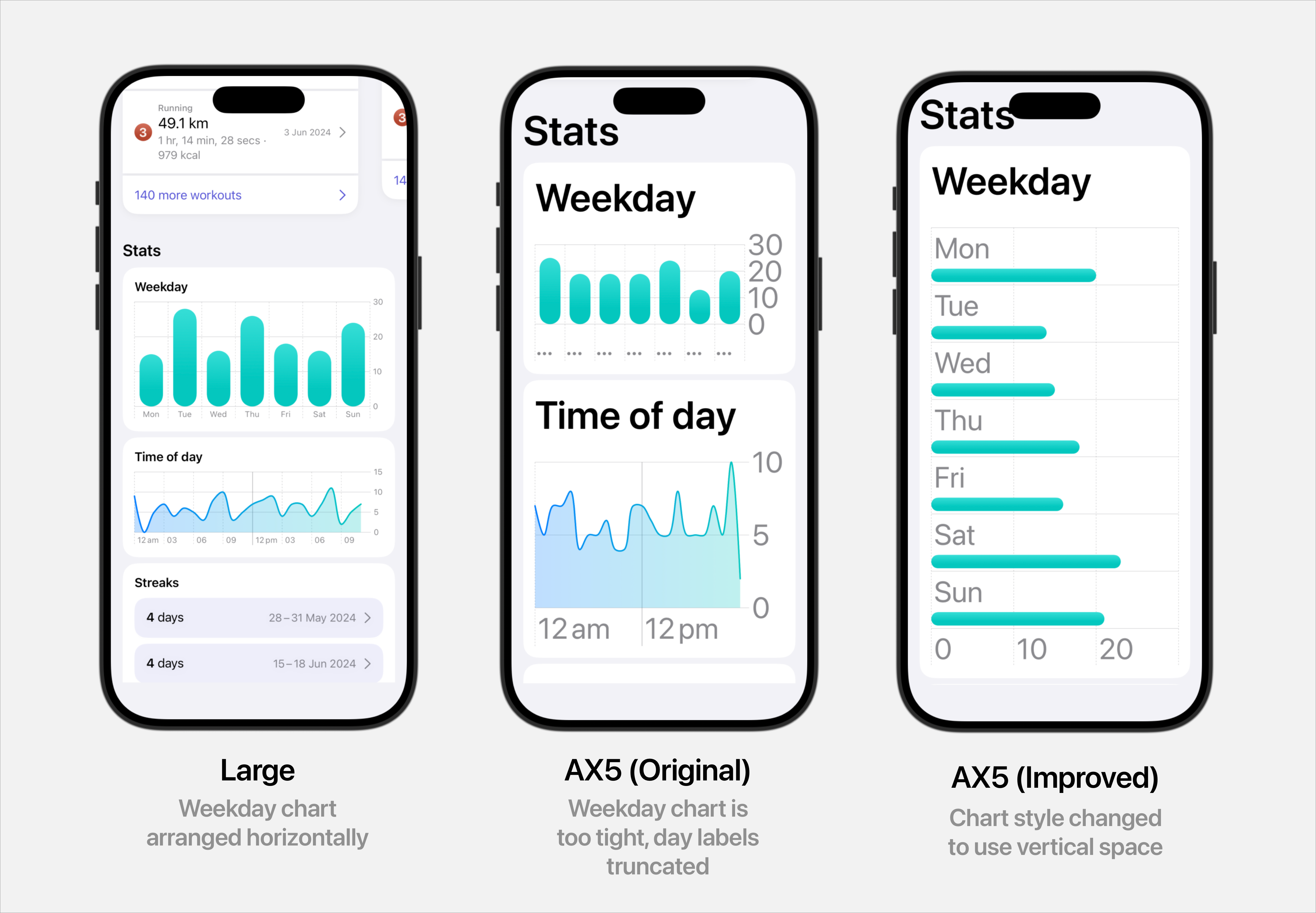
Charts
I had a chart that struggled at larger sizes because of a lack of horizontal space for the text labels. I improved it by changing the chart to use a vertical layout at larger type sizes.
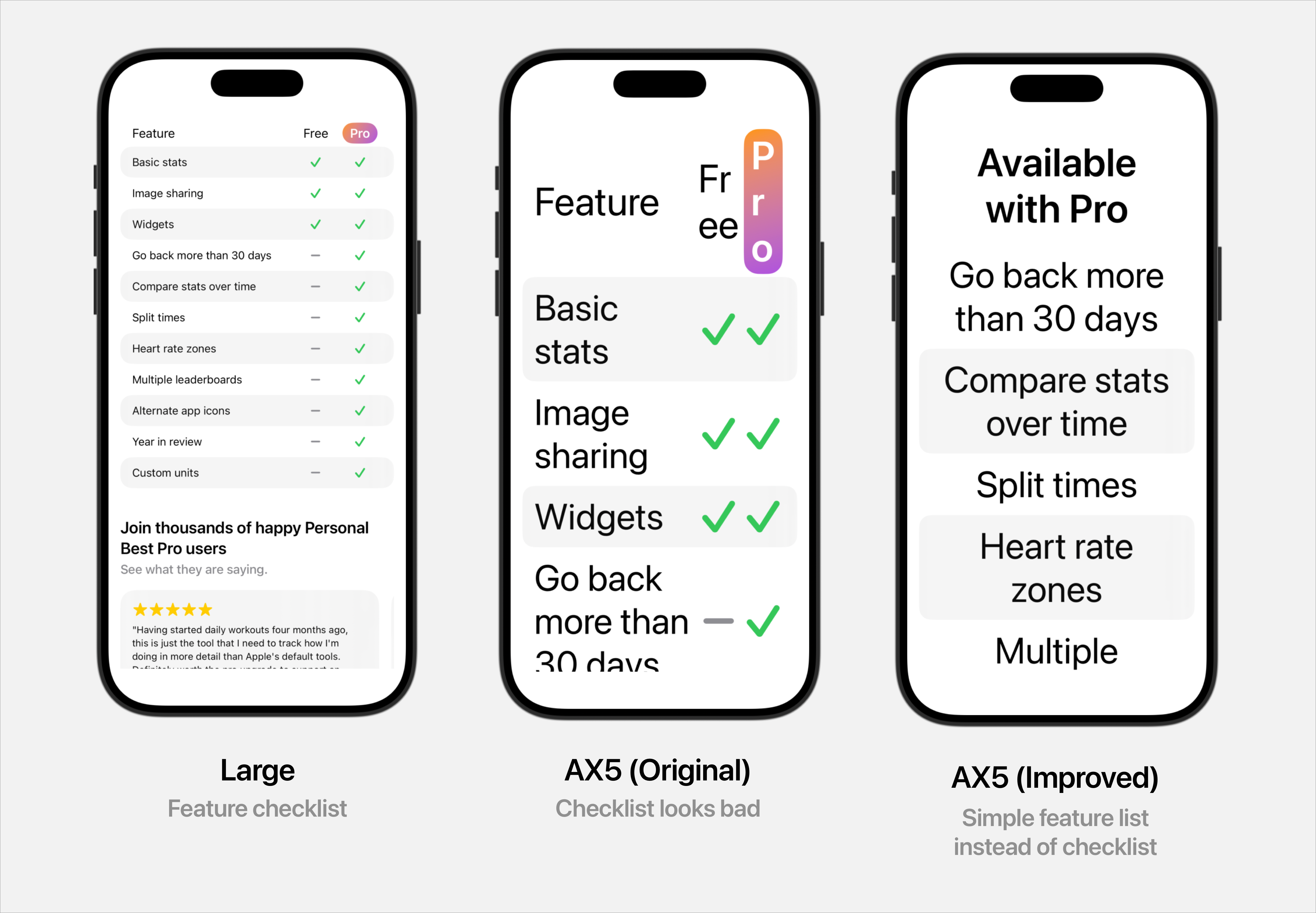
Tables
My paywall features a comparison of which features are available in the free and paid versions. At larger sizes there simply wasn’t enough horizontal space for this to look good, so I switched it to a simpler list of paid features at larger type sizes.
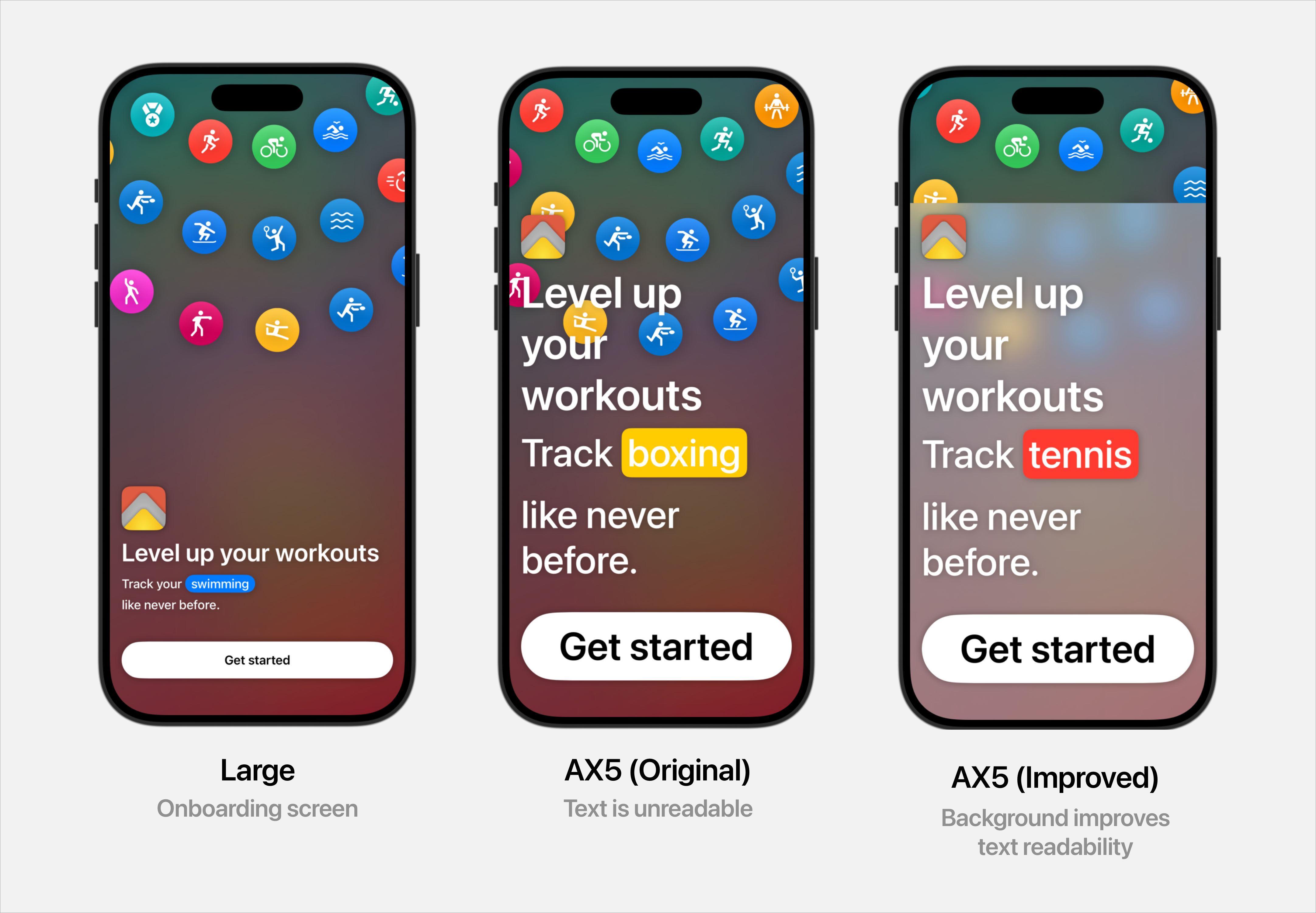
Background contrast
The onboarding screen has a graphic at the top of the screen, where various workout types move in concentric circles. At smaller type sizes this looks fine, but when the text is very large the text clashes with the background, making it difficult to read.
To fix this I added a background to the lower part of the screen which is only visible at AX text sizes. It’s a simple fix, but it goes a long way to make the screen more readable.
Takeaways
Here’s some tips from my own journey into making Personal Best more accessible.
1. Do it from the start
I could have avoided all this work by just making these screens properly support dynamic type from the beginning. It takes about 10% more work to do this from the start, compared to the large effort it took for me to fix the whole app at a later date.
2. Keep it simple
If you fill your codebase with if...else statements for dynamic type support, you’re creating a lot of technical debt and making the codebase less maintainable in the future. Not only will this make work for future you, it’ll also increase the likelihood of you making a mistake and inadvertently breaking your app’s dynamic type support in the future.
Keep things simple by using reusable views as much as you can (like my HOrVStack view), and avoid duplicating your code.
3. ‘Done’ is better than perfect
We all want our apps to be the best they can be, but if you’re struggling to make something look absolutely perfect at large type sizes, just settle for making it usable. It’ll deliver value immediately for your users who use large type sizes, and you can improve it further at a later date.
Further reading
If you’d like to learn more about dynamic type, here are some great resources that I found helpful.
Thanks for reading.
To get in touch, email me or find me on Mastodon.
If you liked this post, you'll love my iOS apps. Check them out below.
Personal Best
Level up your workouts
Taylor's Version
Upgrade Taylor Swift songs in your playlists
SalaryPig
Meet Trevor, the salary-tracking pig
Taylor Swift Quiz
How well do you know Taylor Swift?